Friday, October 14, 2011

AT&T Activation of iPhone 4S = Epic Fail

I couldn't have been more ecstatic to receive my iPhone 4S today!  I even drove home at lunch (25 minutes each way) to pick up the delivery.  I am now moving on to hour 2 of trying to activate my shiny new iPhone 4S.  After looking on Twitter and other sites, I am not the only one experiencing these issues.  I ask myself many questions when this happens:
  • Apple can logistically get this mapped out and deliver on time with the great help of vendor partners (big shout out to UPS for knocking it out of the park and meeting expectations on the delivery time)!  This is a HUGE under taking but they always set expectations and meet them (...and always exceed with the hardware).
  • This is the 5th iPhone released by Apple.  I remember many who experienced this same issue on previous launch days.  I think AT&T should really have a lessons learned session.  Come on...5th release and you still can't get it right?
    • Let's also mention that many of the prior releases, the activation/server issue was not much cause of concern since AT&T had exclusive rights to the iPhone.  Now they have Verizon and Sprint to compete with. 
    • While some might argue that the sheer number of activations of AT&T compared to the volume of Verizon and Sprint are an explanation, I would have to disagree and refer you to the above bullet that this is AT&Ts 5th launch.
      • Preparation is always a better plan than Reaction.
  • Mixed Messages
    • One of the error messages tells me to contact Apple.  Knowing this is an AT&T issue, I decided to try that Apple to see what happened...'Please Activate Your iPhone' (See Above):
  • While I know I will be ecstatic when I can finally start chatting with Siri and using the magnificent camera but it makes me wonder what the point of pre-order is...AT&T knew the number of activations...PREPARE!
  • So...I will continue to stare at the screens below.  What a GORGEOUS paper weight my iPhone 4S will be until successful activation....


It's HERE!!!!


Friday, September 23, 2011

App Review - Tiger Woods PGA Tour 12 - FREE Today!

iPad App is FREE today!!  Download from iTunes

Yes...The Avatar is a bit manly...and she scares me!

YUP...my Golf Game is as bad on the iPad
as it is on the real course!

No way would I pay $6.99 for this App.  Free...it's amazing.  I suppose if you are an avid gamer or golfer, the $6.99 would be worth it.  For me, Free makes it awesome!  I would not have tried it out otherwise.


Pros

  • For today only, this App is FREE!  Normally priced at $6.99 makes this a MUST get today!  
  • I am not typically one that gets a lot of games.  When I saw this on MacDeals, I figured I should download the App.  Immediately, I really loved the UI.
    • The UI has a very real feel of the golf course.  It makes you feel like you are really playing...so much so that the commentators are talking about your swing, which is normally what you're saying to yourself in your head on the course (but they don't drop the F-bomb).
  • Addictive.  Not sure that is a Pro...but it is for me.  I've found a game that I really like to play!
  • Get to build yourself as a player
    • Get to pick the wardrobe
    • Get to pick the sex and wardrobe
  • Different Game Modes.  There is variety in what you can play in the game:
    • Closest to the Pin Challenge
    • PGA Tour
    • Tiger Challenge
    • Multiplayer
    • Play Now
  • Pro Shop Cash
    • There are some elements I list as a con, but you do get an initial starting amount as well as the ability to gain cash if you display mad skills, such as 'Close Approach' to the hole (Apparently I can rock that one).
  • Saves Games
    • This will let you go out of the App and have the opportunity to begin playing where you left off...or start over if you have already completely embarrassed yourself.
Cons
  • To get Pro Shop credits to buy things, you have to pay with an In App purchase feature.  Not that you are required to do this to play the game but it is something to definitely watch out for if there are younger ones using the App.  It's very clear and spelled out that there is a charge, so it isn't that much of a con.  The pay is as follows:
    • $50,000 = $.99
    • $125,000 = $1.99
    • $330,000 = $3.99
    • $2,200,000 = $19.99
  • Upgrade Golfer.  To improve your game and Upgrade some of your skills that your Avatar might not have, you have to use Pro Shop cash.
    • $5,500 for Power
    • $5,500 for Power Boost
    • $3,250 for Drive Control
    • $3,250 for Impact
    • $3,250 for Approach
    • $5,500 for Putting
    • $3,250 for Recovery
    • $5,500 for Spin
    • While I probably need to purchase all of these, as displayed on my score after the first 9...I'll just suffer through listening to the announcers make fun of my mad skills ;)!

Wednesday, August 31, 2011

Mobile & Social Trends

A new slideshare presentation I have put together that compiles some key stats.
To take a look, click here: Mobile & Social Trends

Tuesday, August 30, 2011

iTunes Match Beta "Supposedly" Available


I was very excited when I received the email informing me I could now download the iTunes Match Beta from the Developer site.  In the Developer site it stated that "Important: iTunes Match beta is currently available to developers in the United States."  However, after successful installation and opening iTunes, it states that 'iTunes Match beta testing has begun with an initial set of developers.  Over the next couple of days we will continue to expand our testing.  Please check back later to subscribe.'
Bummer...

Friday, August 19, 2011

Volvo On Call version 2.0 Released in iTunes Today...Kicks It Up A Notch!


Volvo On Call 2.0  Download for Free in iTunes


Volvo On Call Description

Volvo Drives Safety and Security even further with a new free iPhone App.

Volvo On Call is a smartly designed new app that provides a whole new level  of safety and security should you find yourself with a flat tire, out of gas, locked out of your car, or in need of a tow due to a mechanical failure.  It puts you in directly in touch with a roadside assistance agent who can quickly dispatch reliable and professional roadside assistance to your exact location via GPS-enabled technology, 24/7/365.  It even provides the service provider’s E.T.A., as well as updates throughout the event.  Plus, it lets you input critical data about your Volvo – including its VIN – for more efficient service.  And for added safety, Volvo On Call  includes an emergency response button for urgent situations.  Safety comes first at Volvo – we invite you to download the free app today.

What’s New in Version 2.0

For Volvo On Call version 2.0, we have added several features.

Multi-Vehicle Support

With the initial version of the On Call app, users were only able to enter one VIN for use with this app.  Now, owners with two or more Volvos can use the same app for all their vehicles.

Retailer Locator

The retailer locator allows users to find all the nearest Volvo retailers and dealers.  This feature will be helpful for customers in a situation where they need maintenance or are looking to purchase another Volvo.  Users are able to view retailer details such as address and phone number.  In addition, the user can easily access directions to their dealer from this feature.

Maintenance Information

The maintenance information allows Volvo owners to see exactly what maintenance is suggested for certain mileage.

Recall Notifications

Recall Notifications feature lets the user know if there has been a recall on their vehicle so they can take necessary action for a continued safe driving experience.  Specific recall reasons, corrective action advice and contact information can easily be accessed by the user.

Tuesday, August 16, 2011

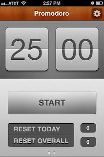
Promodoro - Pomodora Technique - Challenge Myself for the Review of App


The Pomodoro Technique® is a way to get the most out of time management.

The Promodoro App incorporates the foundational concepts of this technique into an easy to use App.  The App is simple, as is the theory behind the technique. 

For a Product Manager, time management is critical.  I had not been exposed to this technique prior to seeing this App in the App store.  The technique is as follows (which was taken from the Pomodoro website where more detail can be found here: http://www.pomodorotechnique.com/):

The basic unit of work in the Pomodoro Technique® can be split in five simple steps:
Choose a task to be accomplished
  1. Set the Pomodoro to 25 minutes (the Pomodoro is the timer)
  2. Work on the task until the Pomodoro rings, then put a check on your sheet of paper
  3. Take a short break (5 minutes is OK)
  4. Every 4 Pomodoros take a longer break


The App consists of a timer and the ability to track the number of Pomodoros on a specific day and overall for App Usage.

Settings allow the user to customize the Pomodoro:
  • Time can be set for 25, 30 or 35 minute increments
    • Ring an alarm at the end
  • Ticking sound
  • Start a break at the end of a timed session
  • Break time can be set for 3, 5 or 7 minutes
    • Ring an alarm at the end
  • Set a Pause time for 15, 20, 25, 30, or 45 seconds
  • Set a Long break time for 10, 15, or 20 minutes


I’m actually intrigued by the simplicity behind the technique.  Due to running across this App, I am going to challenge myself to implement this technique over the next few weeks and will write a review then.  We'll see if it can help diminish my 'shiny ball syndrome'.

The App is On Sale today for Free!  Promodoro App in iTunes

LinkedIn - Kicks It Up A Notch - App Review


LinkedIn released an update to their less than impressive 1.0 release.  Within seconds of opening the App after completing the update, I will have to say…stunning.  They really nailed the UI and UX design of this App.  The icons and graphics are creative, modern and aesthetically pleasing.  The graphics alone will draw me back to the App.  I love that the icon for ‘You’ is a name badge and lanyard…clever and relatable.

I just can’t get enough of this App.  They really did step up their game with this release.  The first release of the App, I might have opened a few times.  I have found myself opening the App at least 3 times already today.  It really is spot on.  Twitter integration is seamless and will entice me to keep coming back to the App.

LinkedIn didn’t just update the graphics.  The user experience and intuitive updates to the features and functionality is spot on.  Some highlighted features that are much more enhanced:

  • Twitter Integration!!
    • It took me a little while to find this feature as it is located at the bottom of the ‘You’ section.  BRILLIANT!!  This provides a very nice design for the Twitter Feed.  I can now update and follow my Twitter from within the LinkedIn App.  This is HUGE!!! 
  • Inbox.  
    • Accessing and sending messages via LinkedIn is much more user friendly with this version.
  • Groups and More. 
    • Accessing the Groups and reading through the updates and streams is even easier via the mobile app than on the website.  Being able to keep up with the latest posts and the ability to respond provides an outlet to make users more interactive with LinkedIn than previously.  There is even the ‘Like’ button…something most users have gotten used to with Facebook has now been incorporated into the experience in this App.
    • Searching through ‘People you may know’ and adding them to your network is now very simple and just a scroll and tap away.

  • Updates.
    • Scrolling through the LinkedIn Today has now become as easy as scrolling through a Twitter feed.  Again, based on the usability and pleasing graphics, this entices me to interact more with this App. 

Pros
  • It’s Free.
  • It’s Beautiful.
  • It allows another channel to keep up with business trends, targeted groups and anything your network is doing.

Cons
  • My con was going to be the App not having Twitter Integration.  That was my first reaction on my first pass through.  It was a bit hidden and not obviously placed.  As you saw above, as I dug deeper, I found it.

Monday, August 1, 2011

iCloud Beta Released for Developers


Late in the day, Apple released the iCloud Beta.  This beta will allow developers to test their apps for compatibility as well as giving a preview to some of the iCloud features.  

Upon logging in, I realized how useful this feature will be for me from a work perspective.  Prior to iCloud, I was not able to access my work email from my Mail App on my Mac due to an issue with the Microsoft Outlook Exchange server.  With iCloud, I was successfully able to access my mail with the amazing UI features offered with the Lion release.  THIS IS HUGE!!!  If they offered nothing else with this release, I would still be content.  This will make life so much easier.  

I will be spending the next few days getting familiar with iCloud and post more information on features and design as I learn more.  Thus far, I'm very pleased.

The UI design is as expected...delightful.  


Pricing for additional storage beyond the 5 GB being offered for free (music, apps, video and photo stream do not count in the 5 GB) has been released by Apple to include:


  • 10 GB = $20 annually
  • 20 GB = $40 annually
  • 50 GB = $100 annually

Wednesday, July 27, 2011

ROAR! Lion is here...and I LOVE it!


I have installed Lion OS for my MacBook Air...Needless to say...I LOVE it!!  I have been using it for almost a week now and think the features added are incredible.  I absolutely love that my MacBook Air now feels very much like my iOS devices.  A lot of the best features are now incorporated into the software.

One Issue...

  1. Before installing Lion, I should have downloaded the Beta 3 Release for Apple TV.  Lion OS does not work with the current version of Xcode I have installed.  Trying to install the updated version of Xcode has consumed SO much of my time last evening.  I thought the simple download from the App Store of the new version would be simple.  Instead of just informing me that I didn't have enough space on my drive...the error message read this: Please consult /var/log/install.log for more details.  Really?!?!?  Couldn't the download detect and inform me that I just need more space.  I did some clean up and was able to install correctly.
Features


For a full list of features, click here: What's New in Lion
    • Versions.  This is probably my favorite feature with Lion.  While working in Word for Mac, I can now go back through versions of the document.  This is much more than an auto save.  It doesn't write and replace.  I can go back through any changes I made at a moment in time and use the changes made.  I had one document that I made several changes and when I went back through Versions, I had 20 there, which allowed me to capture and re-enter some thoughts I had.  Really great!
    • Scrolling.  There have been a lot of reviews and skepticism of the new scrolling feature.  Some really despise this new feature and some really love it.  I am one that LOVES it.  It feels completely natural!  It mirrors the functionality of scrolling on the iPhone and iPad devices.  For most that have used a PC or Mac, we have been conditioned that when we use a scroll wheel on a mouse or scroll in general, when you would scroll up, the page moved up and when you scroll down, the page would scroll down.  In lion, when you scroll up, the content goes down and when you scroll down, the content goes up.  
      • There is an option to turn this feature off.  
    • Launchpad.  This feature takes the UI and functionality design of the iOS devices.  This provides a desktop that has all the Apps which you can rearrange, put into folders and easily locate what you are looking for.  In order to rearrange the Apps, you hold your mouse down and the icons begin to jiggles...just like on the iPhone or iPad.  Streamlines the experience of all my Apple devices.
    • Multi-touch gestures.  This is a really great feature!  Again, it feels very much like using an iOS device.  It is intuitive and allows for fast and easy navigation.  My favorite gestures (not the comprehensive list of features):
      • Two Finger Scroll.  This allows you to scroll up and down content on the internet or in documents.
      • Tap to Zoom.
      • Swipe to navigate through things I have been working on
    • Mission Control.  This is an excellent feature.  Let's me get a bird's eye view of everything open and running on my system and allows for one easy click to get there.  Very intuitive and creates efficiencies I never knew I needed :).
    • Resume.  This is a nice feature.  When I shut down or restart my MacBook Air, it will automatically open everything I was using prior to the shut down and place it where I was working on it before.  Simple but efficient.
    • Photo Booth.  There are some really playful things, such as the floating birds that include facial recognition and follow you around.  It's a great waste of time ;)!
    • AirDrop.  I have yet to try out this feature, as there aren't many in my office that use Macs, but I love the concept of it.
    • Mail.  A lot of new features with this one.  I'm unable to access my work email (not a Mac issue...my company exchange) but it is great for organizing all my other messages
      • Conversations is a great component that provides an easy way to read and organize messages
      • The search capabilities are granular and phenomenal
    • Full Screen Apps and Safari.  Makes the content easier to read and provides a lot more real estate, giving a lot of new opportunities for developers.
    • New Desktop Pictures.  As you see in the picture on this entry, I have chosen the Lion.  Love the detail and how crisp the picture is.

      Friday, July 15, 2011

      The Fantastic Flying Books of Mr. Morris - App Review

      This App is magical.  It seems amazing to me that less than 2 years ago the iPad was introduced and we now have Apps like this.  This App is a combines storytelling, animation, movie and interaction.  This App was created by Moonbot studios and really demonstrates the endless possibilities that the iPad offers. This App sparks a whimsical feeling.  It allows an escape to childhood.  It provides a brand new and exciting experience.  I love this App.

      The Fantastic Flying Books of Mr. Morris - $1.99
      The Fantastic Flying Books of Mr. Morris - HD - $2.99


      Pros

      • This provides a new and exciting type of way to consume media.  It is incredible to watch and interact in a way that has never been possible before.  
      • The animation is excellent.  In the description of the App it states 'Old fashioned and cutting edge at the same time'.  Absolutely.  
      • The App only cost $1.99.  Quite honestly, it could definitely go for more than this.  The experience is worth it.
      • You are able to interact with the movie.  In one area, Morris's book lost it's words, and as you can see in the picture above, you have the ability to write in the book.  Just these small touches that make you feel part of the story.
      • The imagery and storytellers voice are very aesthetically appealing.  
      • Creates an experience to spark imagination...and who doesn't like to get lost in that?
      • I really like that it has the 'Pixar' type of feel.  
      • Engaging and Inspirational
      Cons

      • I know there is always a Con somewhere...but I just can't seem to find it with this one.